Alright, so I’m a little hesitant to post these as I’m not sure if those in the ad world want to reveal what I assume everyone already knows, every advert image is photoshopped to death. In fact, these aren’t even the finished images, they’re just how far I went before handing them off to our graphic artists at work. Anyway, questions comments…etc. Jesse    
Read More
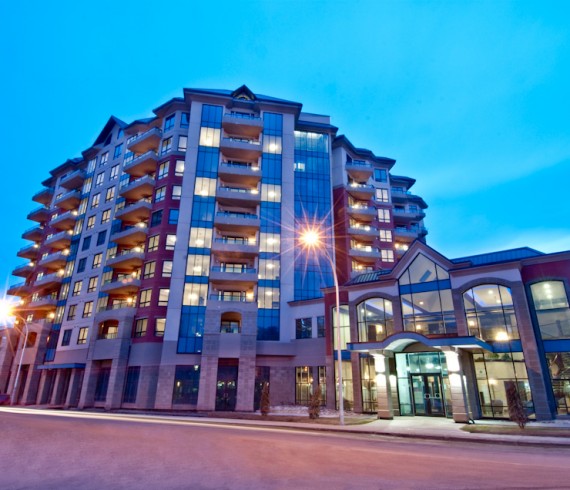
These are some shots of a luxury condo downtown Edmonton, this was my first attempt at architecture photo jazz. I’ve gotten a lot of practice since snapping these, and gotten much better, these were educational for me. Being a completely new kind of shoot, I was a little out of my comfort zone but, I think I’ve gotten the hang of it.                         Yes, it has been literally months since my last post, I’ve had my web design hat on for a while, but I’m still shooting, and will be like crazy in the coming months so stay tuned.
Read More
Ok, so we shot this way back in August and to be perfectly honest I’m not the most proud person…. I hate pretty much everything “creative” I do… at least the first time around. We shot it last summer, I was editing in the begining in the fall and it’s been on “the interwebs” for about 4 months or so. This was my first attempt at cinematography and editing, it’s not really finished, but this is probably how it will remain for the next while. Keep it real, stay classy, keep your stick on the ice? It’s called ‘Edgars Epilogue’
Read More
I had a lot of fun with the last post so I decided I would give it another try. This didn’t go as smoothly as I just didn’t have any fresh ideas. I tried to remain simple here so it’s very two demential. If anyone has any constructive criticism that would be welcomed. I’m always trying to learn so let me know what you think. J            
Read More
Well, I honestly couldn’t say whether or not this is my first attempt, I think I have a vague memory of messing around with this stuff when I was in about the 5th grade. I really should have contiuned with it then rather than following that phase with about a 10 year hiatus from graphics. Anyway, this is something I put together tonight over about an hour or so…. hmm maybe over 2 hours… my skills are a little rusty.
Read More
I was sorting through some old work last night and came across this image. I was doing still photography for an independent film here in Edmonton and Tito Guillen (Director) wanted to use this shot as the poster. Unfortunately this was just one of those shots that didn’t work out, basically it’s terribly out of focus and our actor is yawning in the shot. There was also a lot of negative space on the left side which bugged me so I decided I was going to work on it a little before I gave it away. Here’s what I came up with. Be sure to click the thumbnails to see the full before and after images. haha, I should mention that 98% of what I usually do in photoshop is color modification and shading. I never transform any of my portraits like I did this one. This was just one of those instances where I had to salvage a shot I would normally have deleted. In this case as I was editing a story and a characters appearance, not solely a person in a portrait where I wouldn’t ethically be able to modify this way. J      
Read More