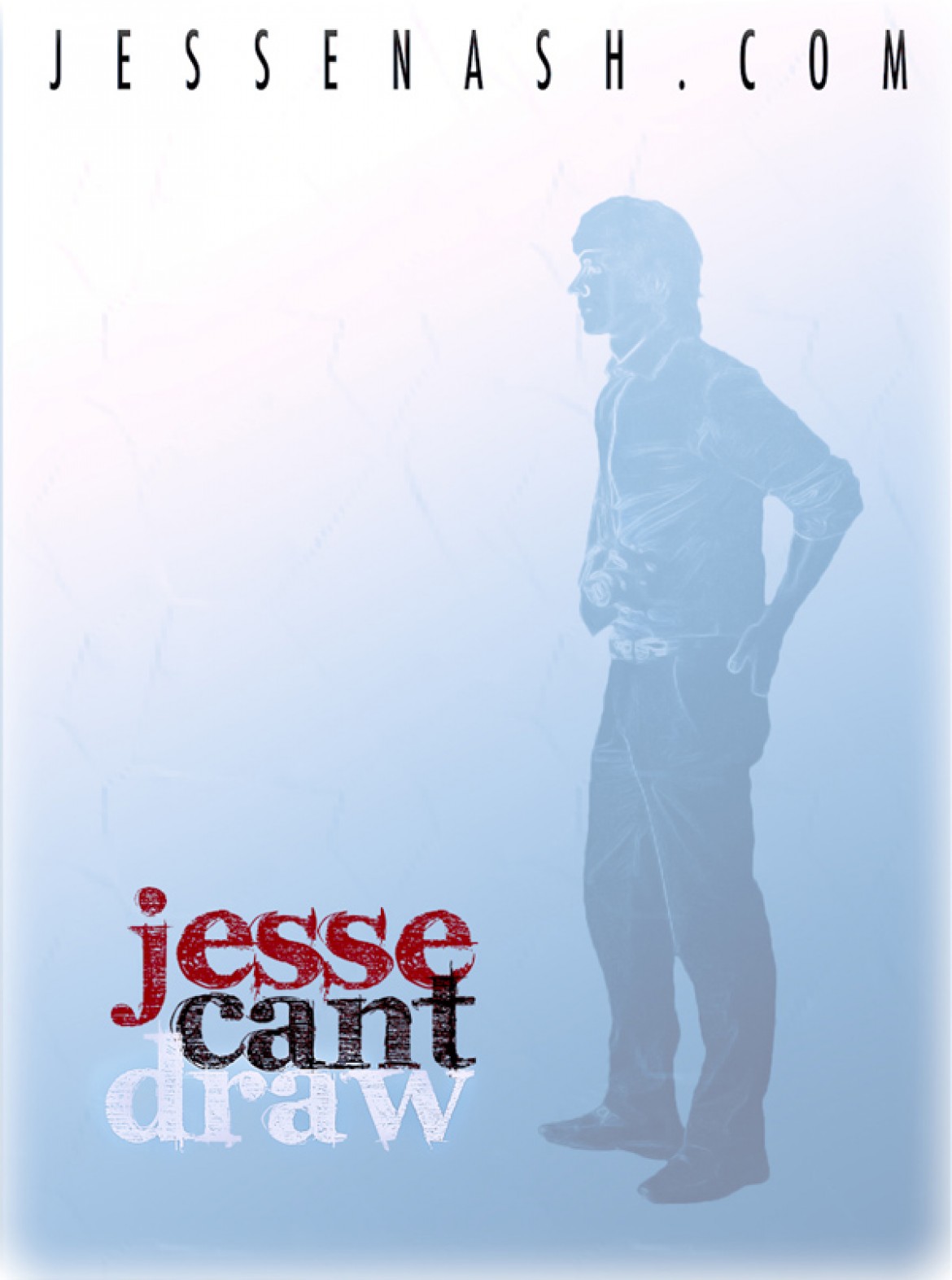
I had a lot of fun with the last post so I decided I would give it another try. This didn’t go as smoothly as I just didn’t have any fresh ideas. I tried to remain simple here so it’s very two demential. If anyone has any constructive criticism that would be welcomed. I’m always trying to learn so let me know what you think.
J


good composition as always. you said you were going for a simple design, based on that, i think you should minimize the colors being used. the ‘jesse can’t draw’ logo would probably work best as one uniform color. people have a tendency to read in shades, so the first thing i notice is the ‘can’t’ followed by the ‘jesse’ and then the ‘draw’
if you make it all black/red then you’re putting attention on the logo. but if you go white, the focus shifts to the picture itself. depends what you want to do.
imo. i would change the font of the top text as well, seems really 90’s movie poster-ish. but that’s my opinion, it may be what you’re going for.
well done regardless.
Yeah, I did try one colour for the text but the image still seemed a little flat to me. I didn’t want to focus too much attention on the photograph as I didn’t really have a good one to work with. This image was more of a practice run, and I do feel it’s off somehow, but I think it might be in the composition more than anything else though. I might be able to make the image work if I draw in the outline of a an angled wall, give it some depth. I guess I don’t want it too simple but after thinking about it, I realize I was compensating for the photograph with a little colour. It wasn’t the photograph I wanted. Anyway, I’ll keep experimenting with it, probably after I do a series of self portraits. haha also, I was going for the 90’s movie poster look, that’s actually exactly what was on my mind when making this.